← Back to Projects ES|EN

BlueBat Games: a design system for multiple casino brands

Role

UX/UI Designer

Year

Feb 2023 – Dec 2025

Company

BlueBat Games

Scope

UX/UI · Design systems · Documentation and handoff

About the project

One platform, multiple identities

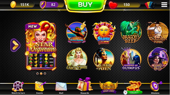
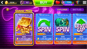
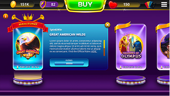
BlueBat Games is a Canadian white-label company that develops social casino products for different brands. I worked on evolving these digital experiences, creating reusable solutions that could adapt to each client without losing its identity.
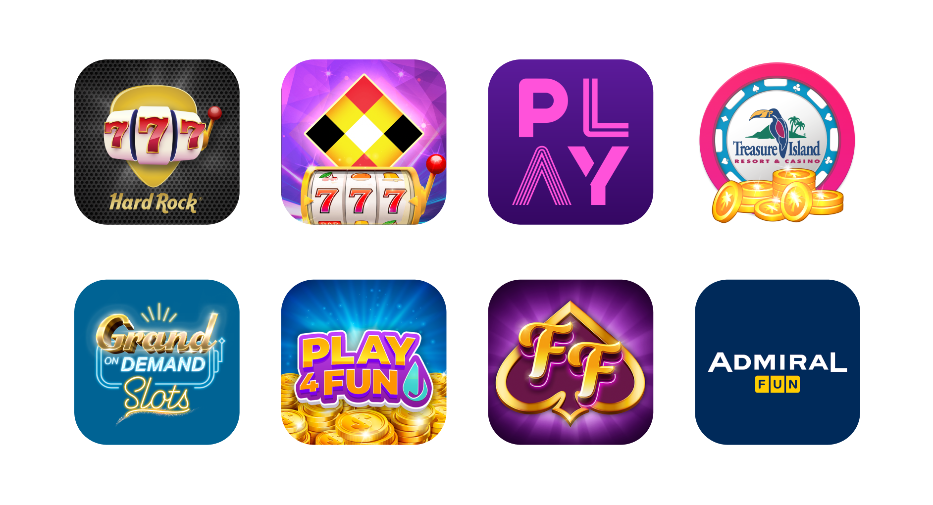
BlueBat Games apps
The challenge

Consistency without losing identity

Designing scalable experiences on top of a shared product base, while keeping each brand's personality intact. At the same time, we needed to improve our design processes and system documentation, simplifying handoff with development.

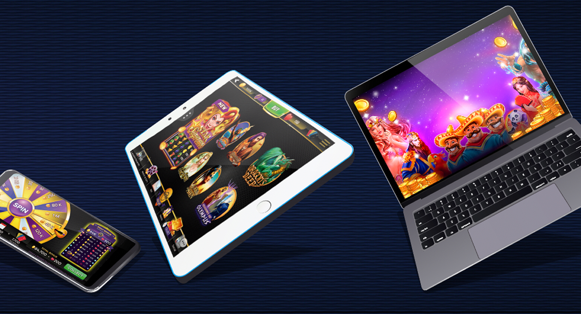
Devices with BlueBat products
Process
01

Audit — Review of existing products, shared UX patterns, and technical constraints.

02

Define each brand — Analysis of identity, client needs, and visual direction.

03

Build the system — Defining reusable patterns for navigation, components, and key screens.

04

Design and adapt — Applying the system to Lobby, Store, VIP, Missions, Rewards, and other features.

05

Work with development — Documentation, handoff, and ongoing collaboration with Front-end and QA.

Lobby Coin store VIP room
Shared system

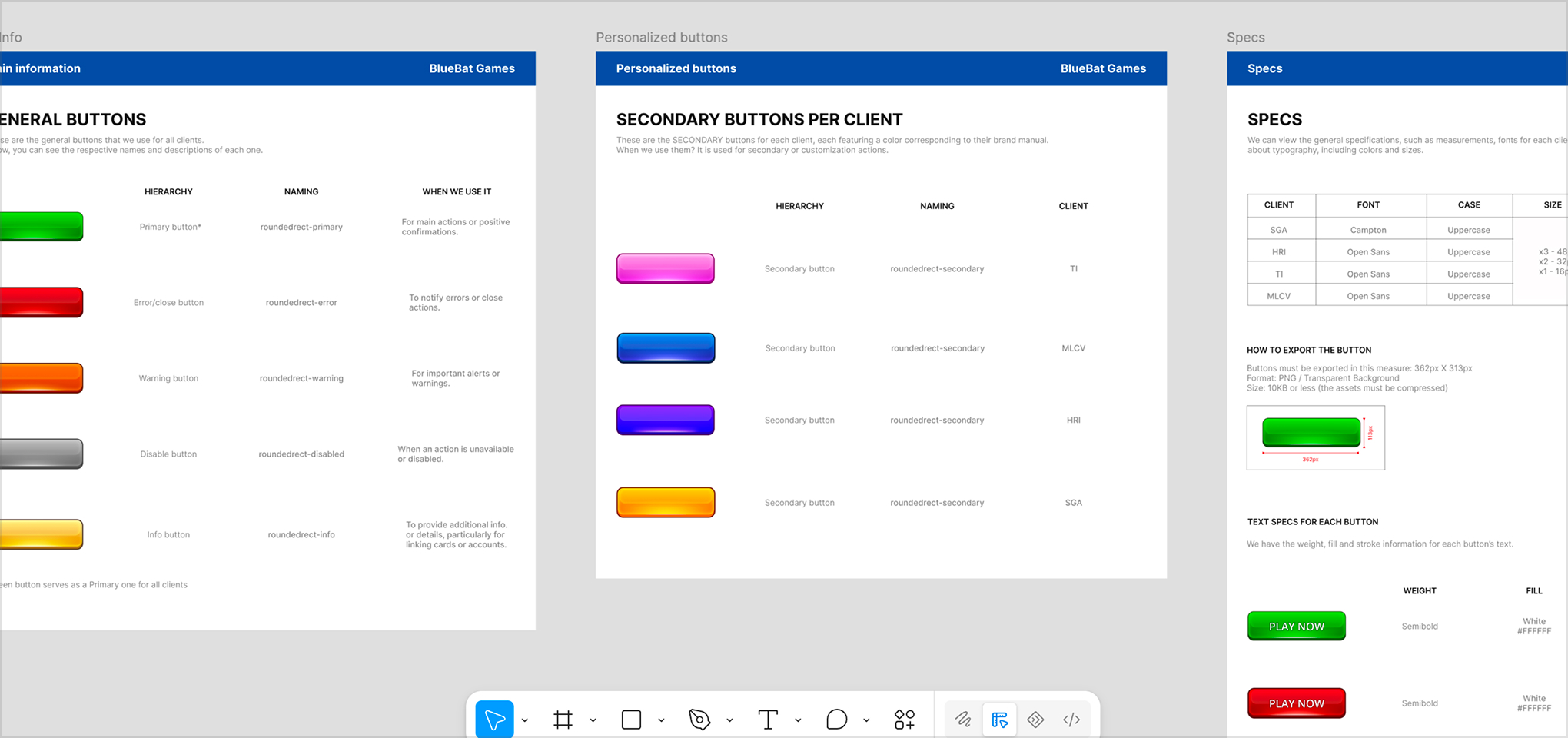
Reusable components and tokens

The same component library, states, and navigation patterns adapt to each brand without duplicating work.

BlueBat component design system
Featured redesign

Rewards Center

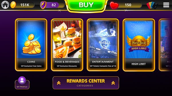
I redesigned the Rewards Center, moving from a modal to a full-screen experience with more room to organize bonuses, categories, and rewards, and make them easier to find. The new structure reinforced visual hierarchy and resulted in a flexible solution that adapts to different brands.

Rewards Center

From a constrained modal to a scalable experience

The Rewards Center originally worked within a modal. As the feature grew and more content was introduced, this format began to limit the organization of information, navigation, and the ability to scale the experience.

Before

  • Limited space.
  • Unclear hierarchy.
  • Difficult to scale.

New proposal

  • Greater clarity.
  • Better organization.
  • Scalable structure.

01The problem

The available space made it difficult to establish a clear hierarchy and introduce new functionality. Before redesigning the interface, we analyzed whether the problem could be solved by reorganizing the existing modal.

02The decision

Keeping the modal required a smaller change, but it preserved the same structural limitations. I therefore proposed transforming the Rewards Center into a full-screen experience, providing more space to organize rewards and a structure prepared for future growth.

The decision was not purely visual: it required us to rethink the navigation, content hierarchy, and the way users accessed the feature.

03Collaboration with Development

The proposal was reviewed with Product and Front-end from the early stages to validate its feasibility. During handoff, I documented components, states, and interactions, and supported the implementation alongside Development and QA to maintain consistency between the design and the final product.

Results

The new proposal allowed us to organize the information more effectively and create a clearer, more flexible experience that could be adapted across different white-label applications.

The solution used reusable components and patterns, maintaining a consistent interaction logic while allowing each brand's visual identity to be adapted.

About BlueBat Games →

The product is available within each brand's apps.